Arlanda express
From Vision to Action
When it’s not the destination nor the place, Arlanda Express focuses on people – helping them recharge, find peace of mind, and start and end their trip on a high note.
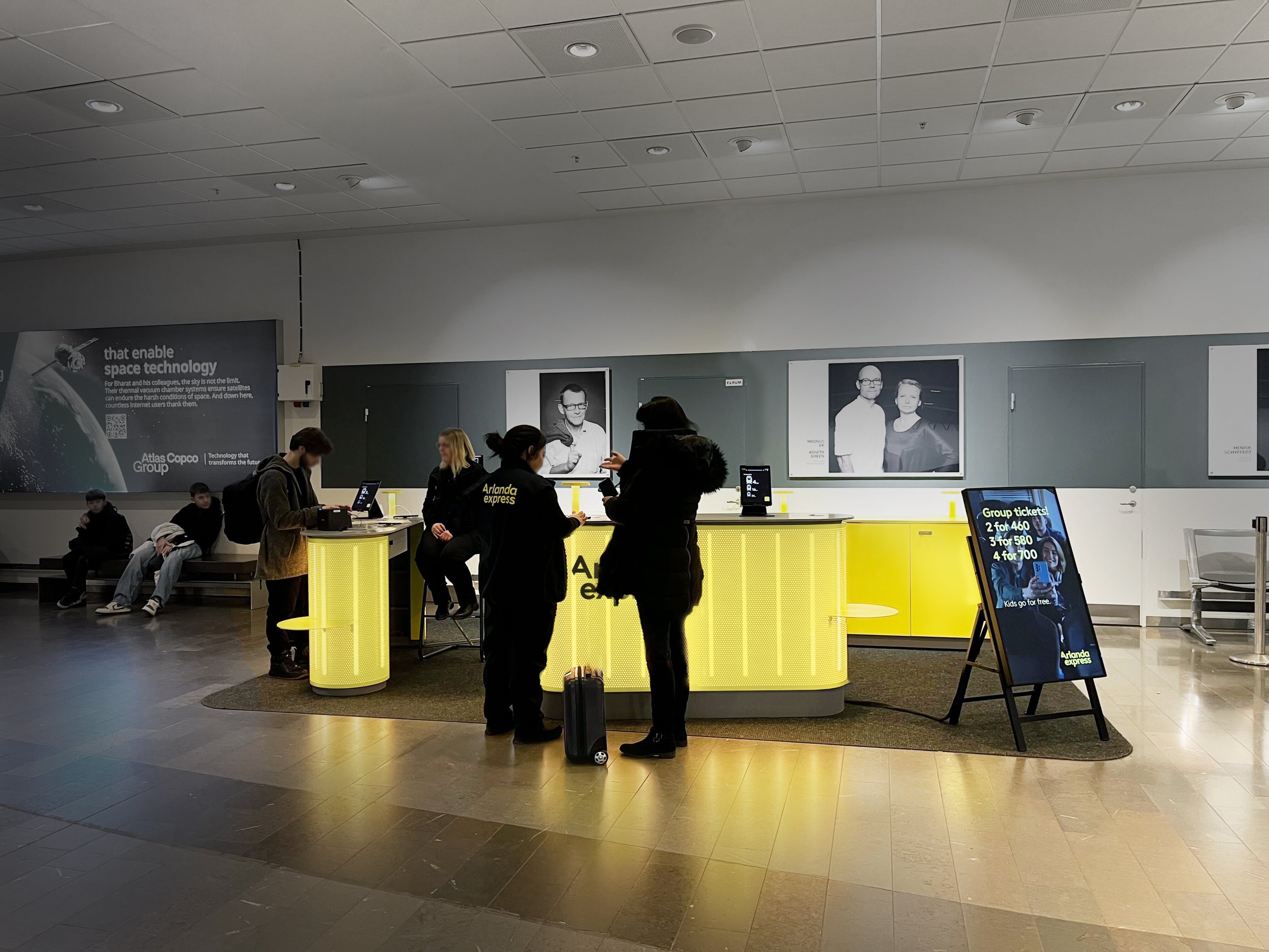
The team behind TBD To Be Designed made the Red Dot award-winning visual identity for Arlanda Express - Logotypes, colours, font, signage systems and have continued to refresh and implement their brands strategic endeavours since 2020 - To a cohesive Brand Experience. Our work spans visual identity, train livery, rooms, signage systems, wayfinding, services, clothes, sales desks, business innovation as well as vision for digital channels and Ticket machines, and future trains – Always ensuring the brand communicates consistently at every touchpoint… And it’s only the beginning.
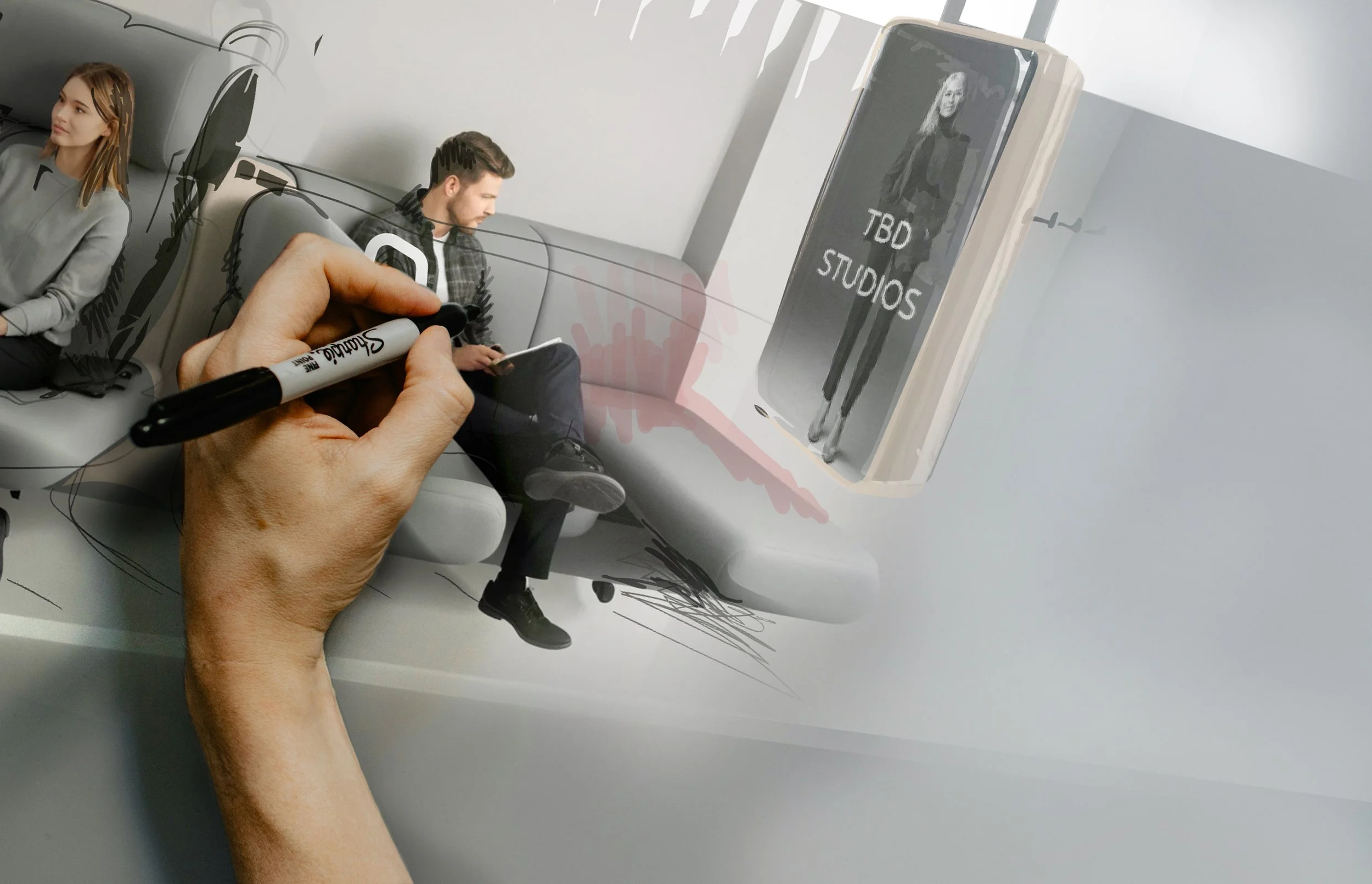
News! We supported Arlanda express (A Train) in the procurement of their future trains with a clear Brand & Customer Experience vision. Best way to know that what you buy now will end up delivering on brand promise when they arrive in 7 years, and beyond. Winner of the New Cabin of The Year 2025 at the Rail Interiors Awards. A recognition that highlights the power of strategic brand experience.
We delivered:
1 Brand Experience Vision.
2 Vision Story, with tangible end states (example here).
3 Key Experience Factors.

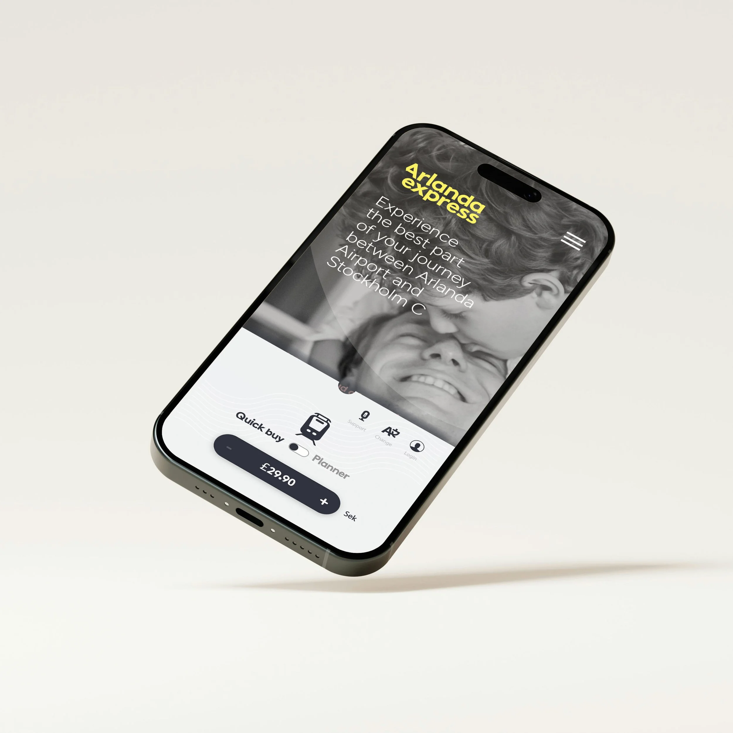
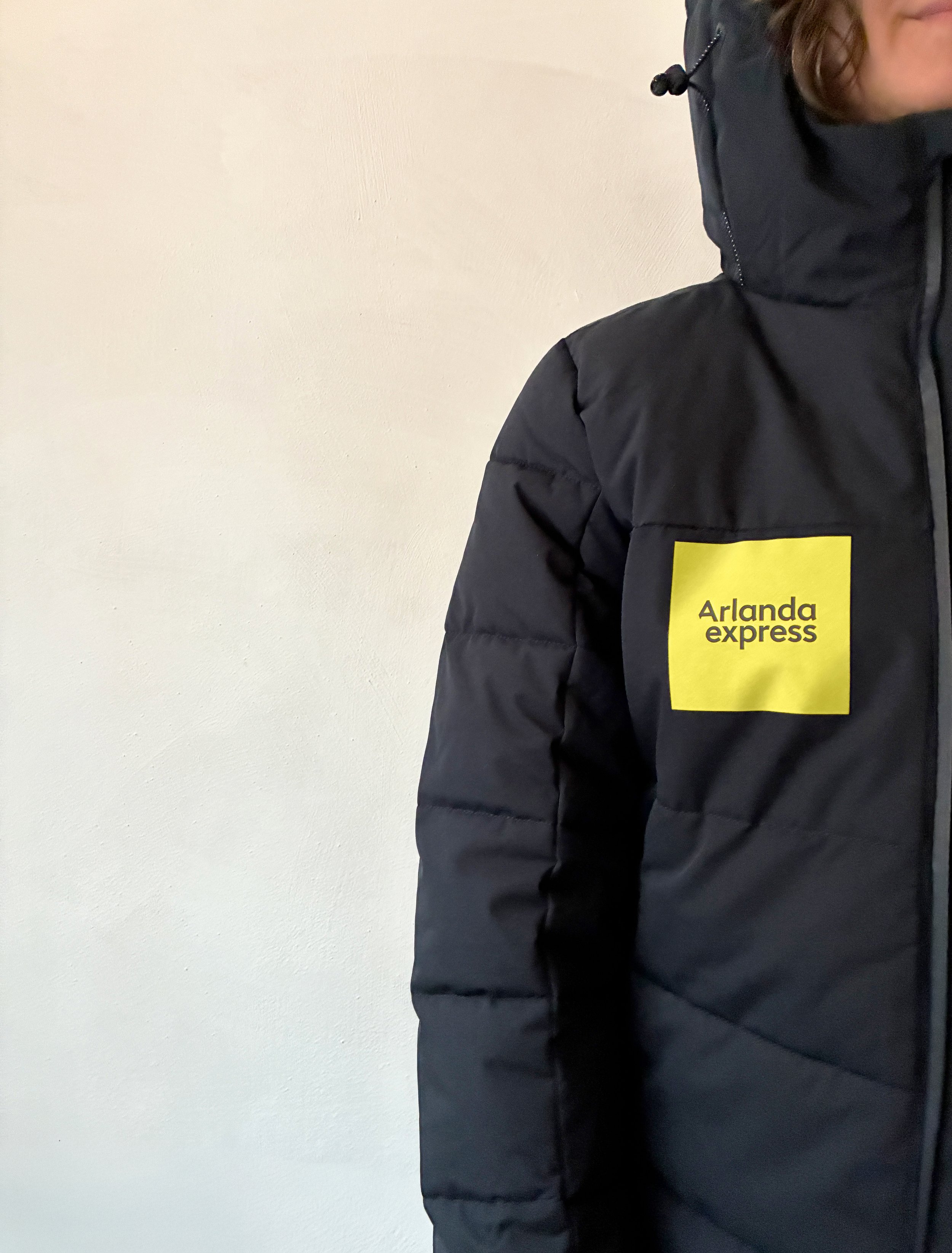
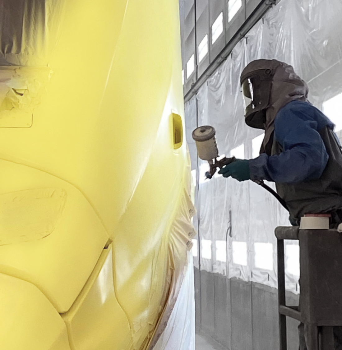

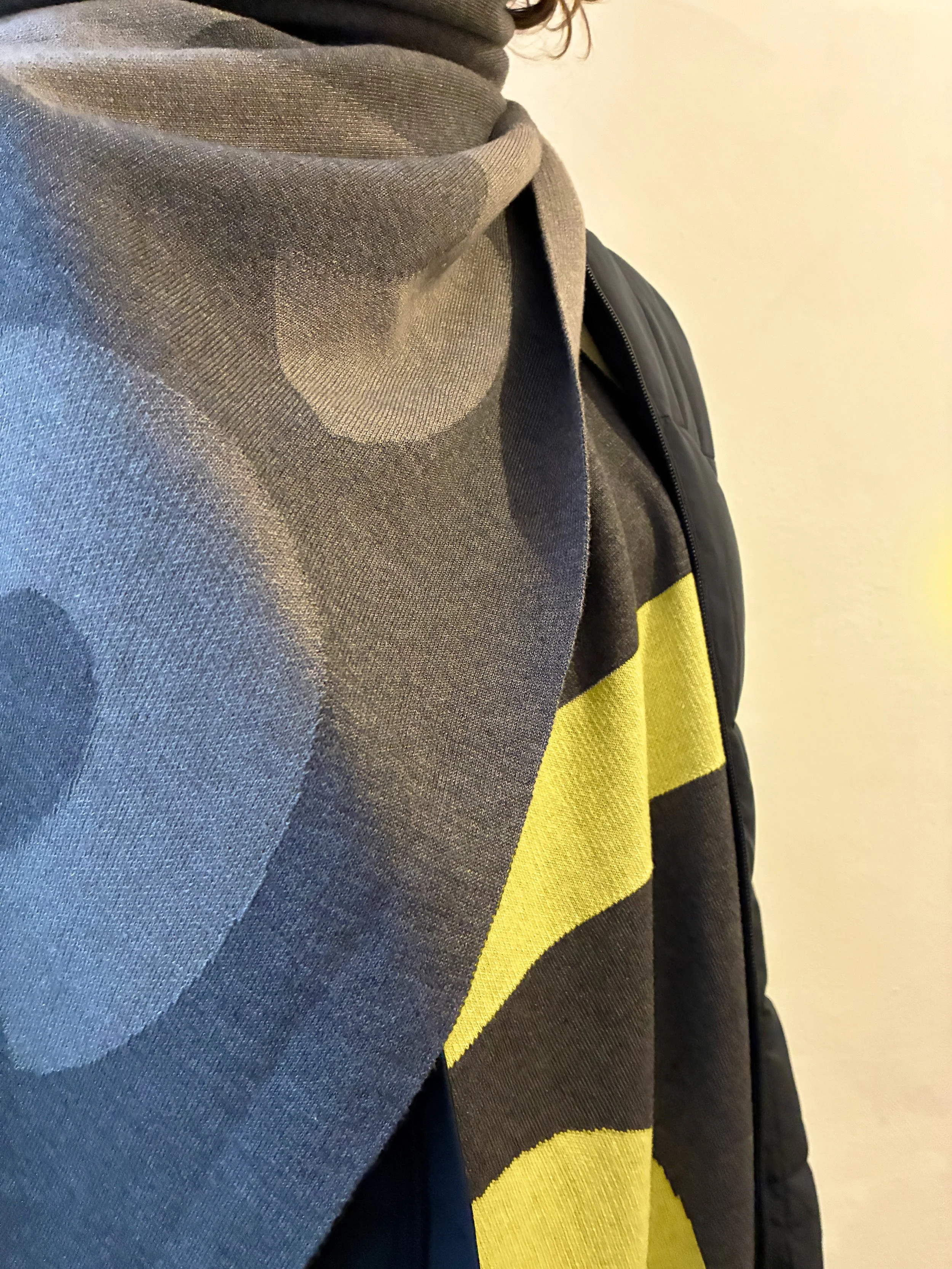
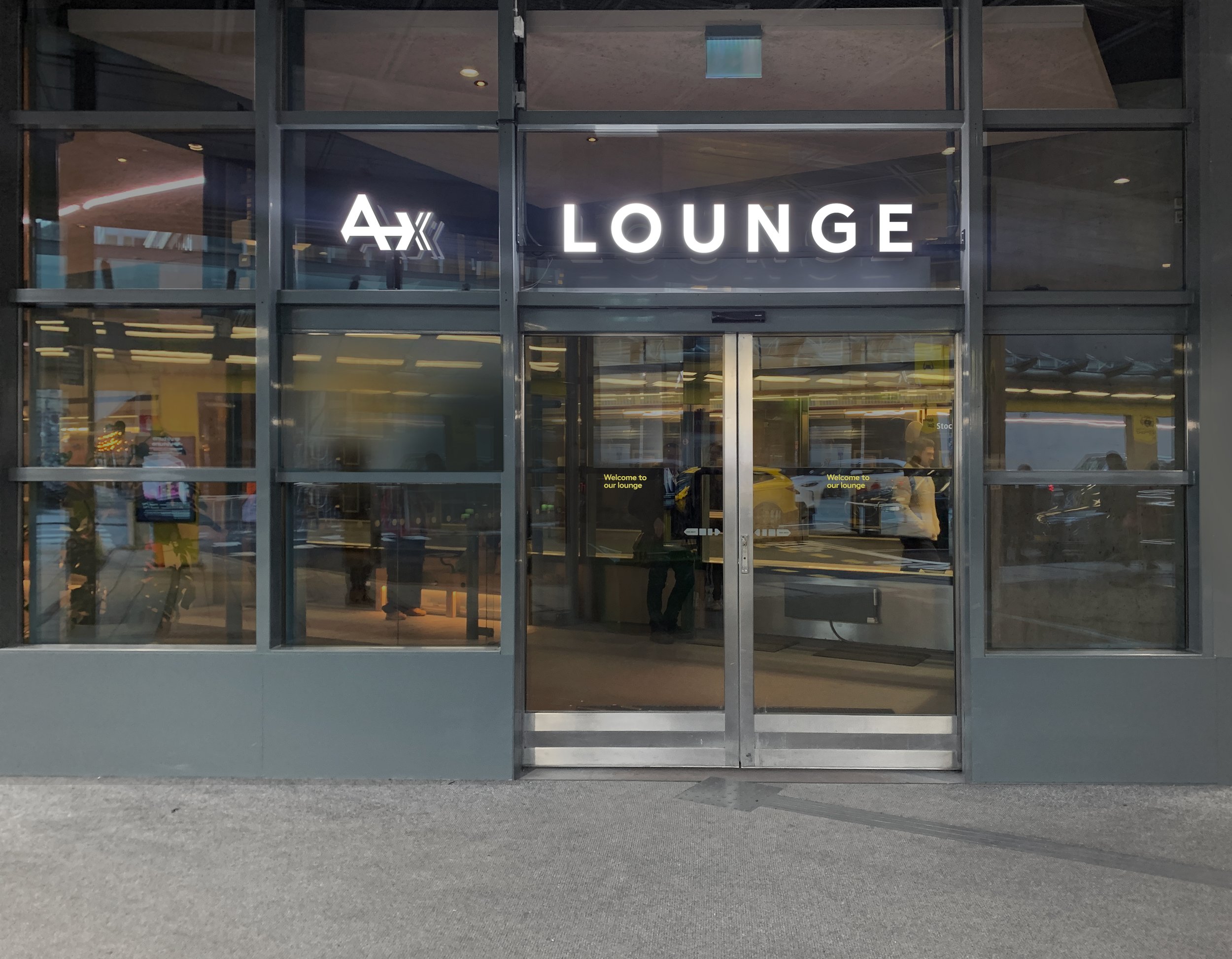


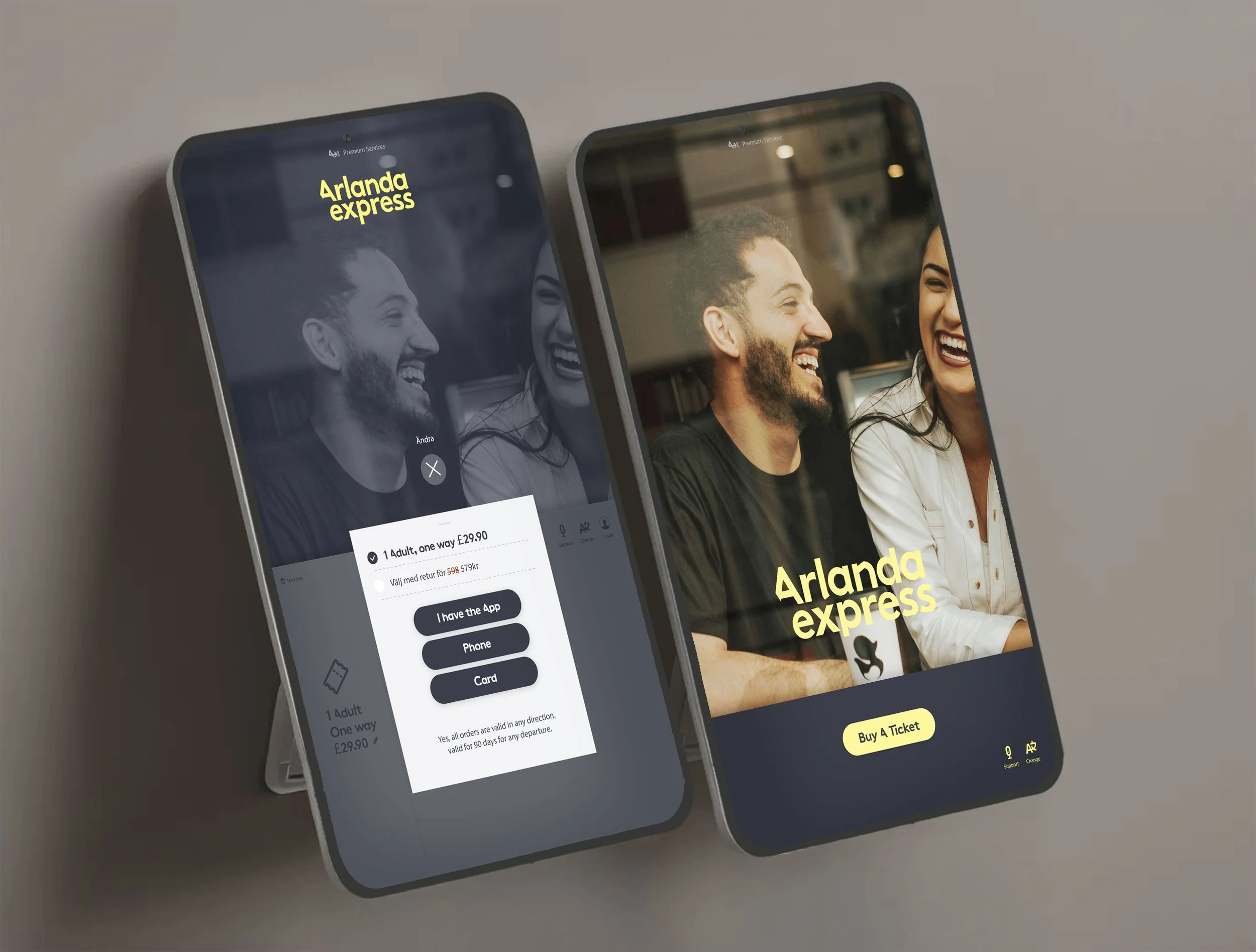

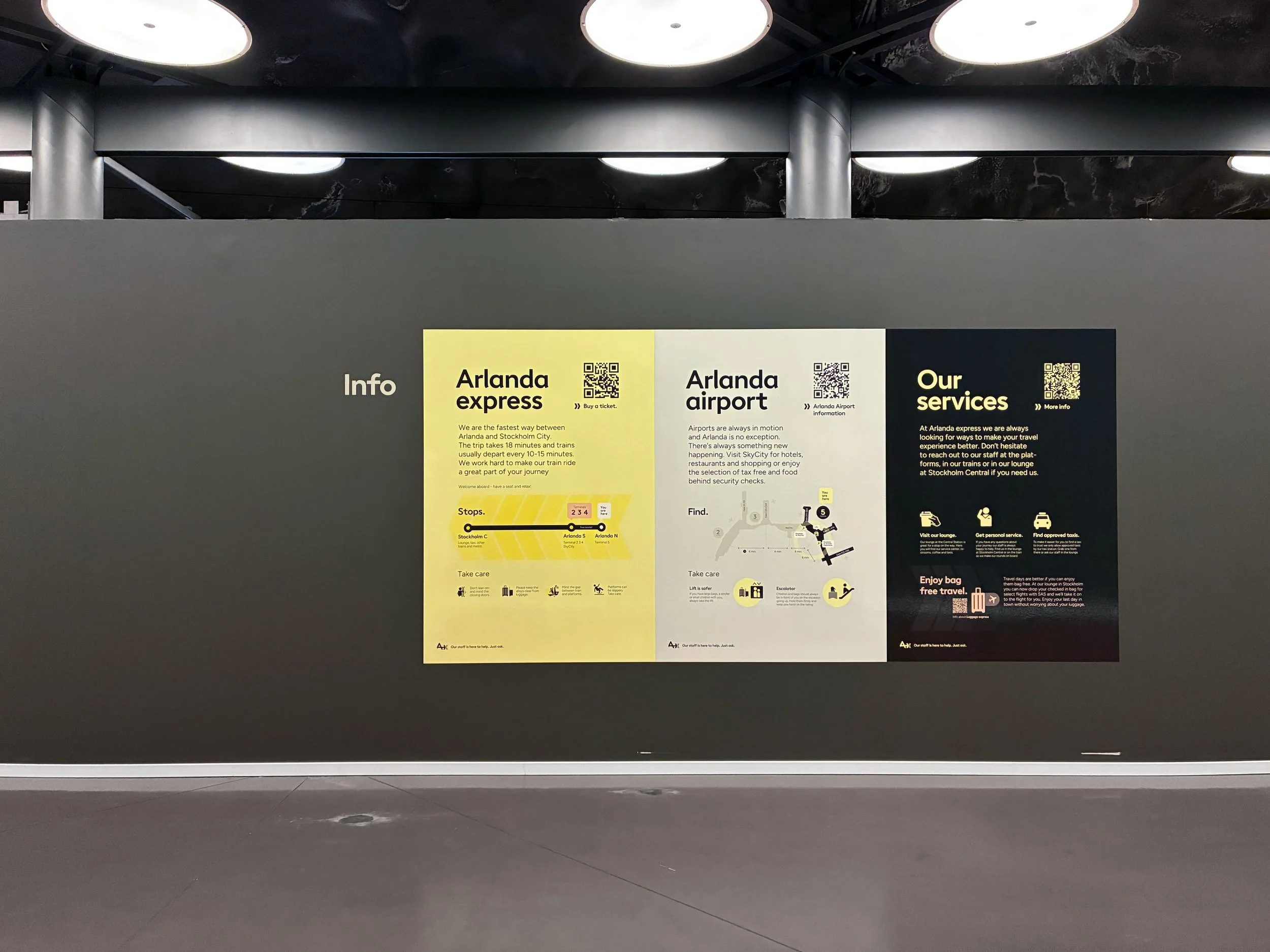
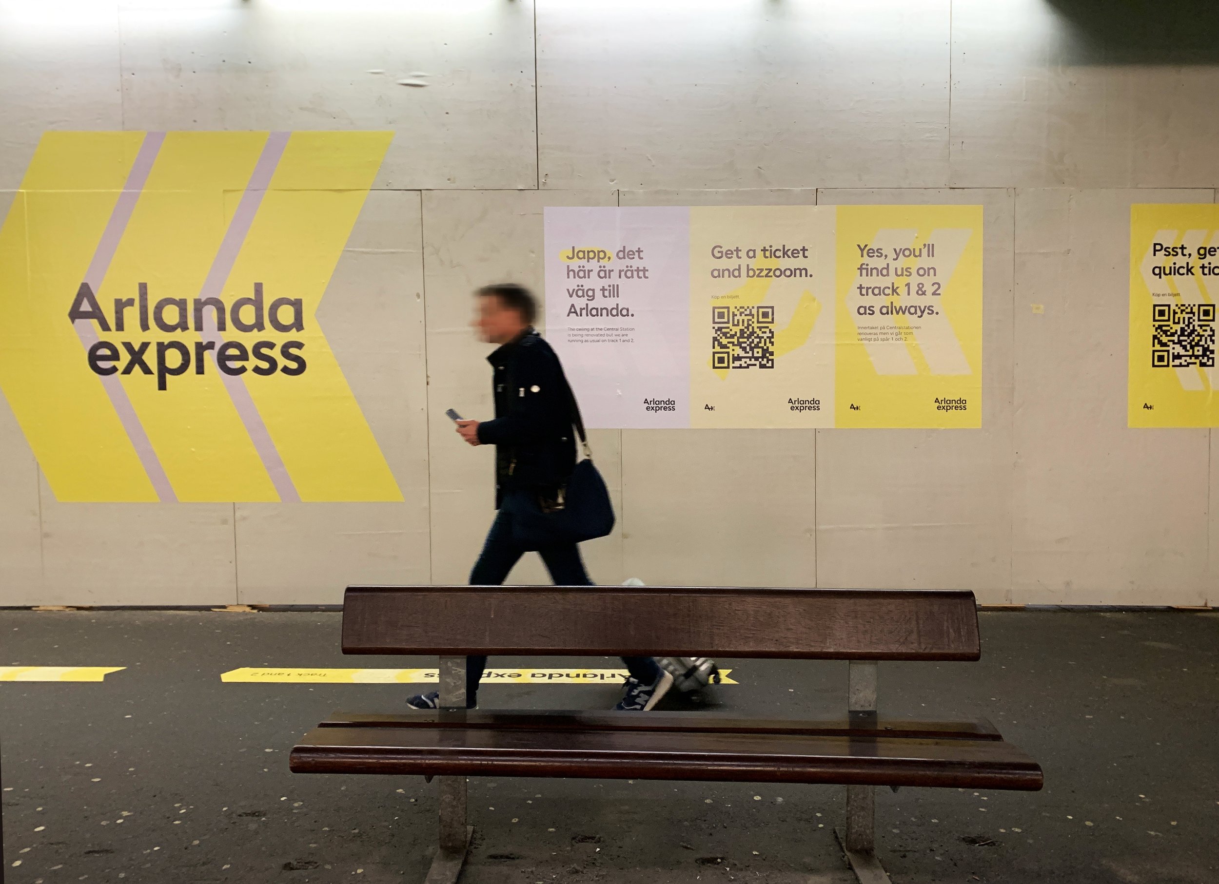

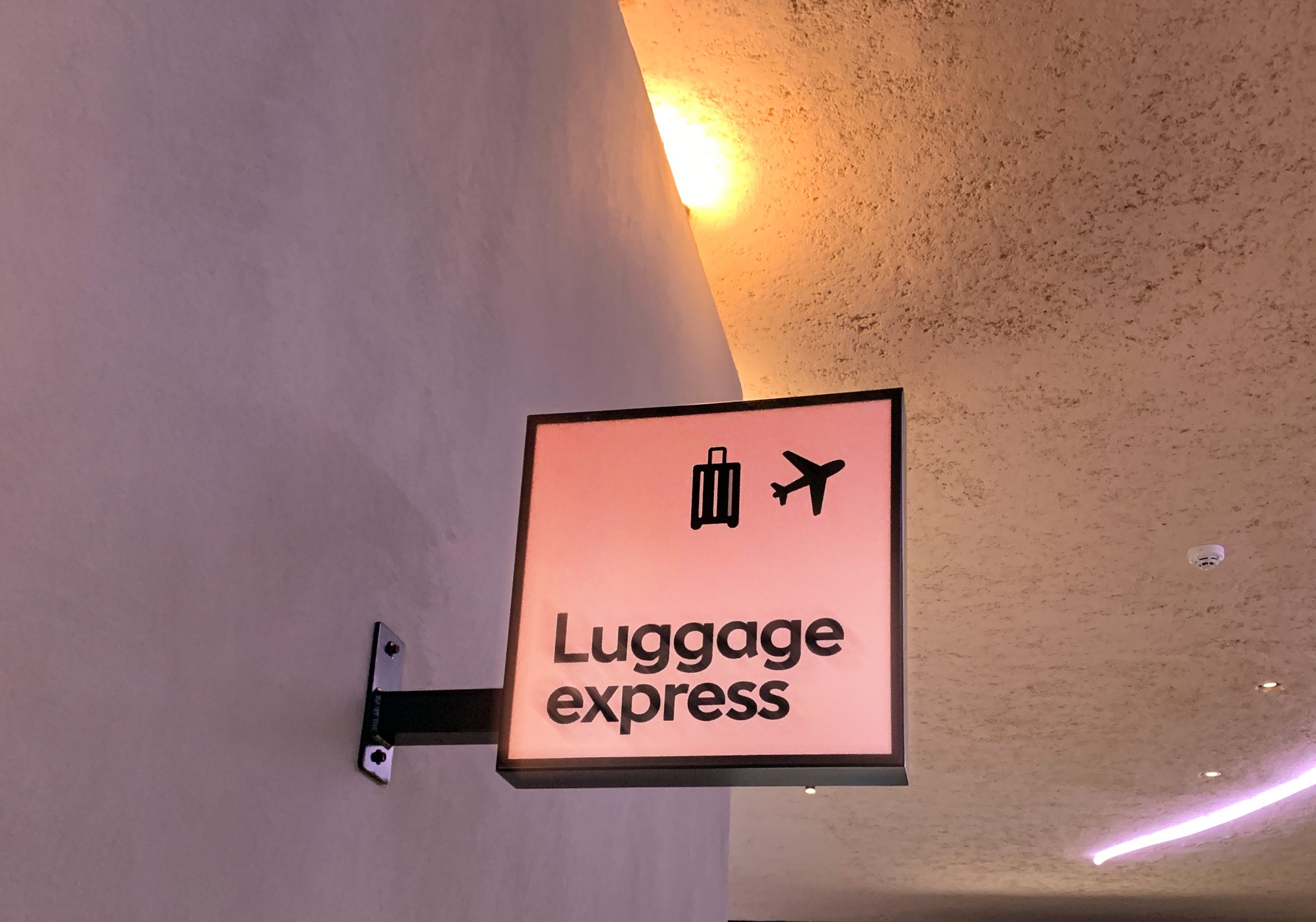


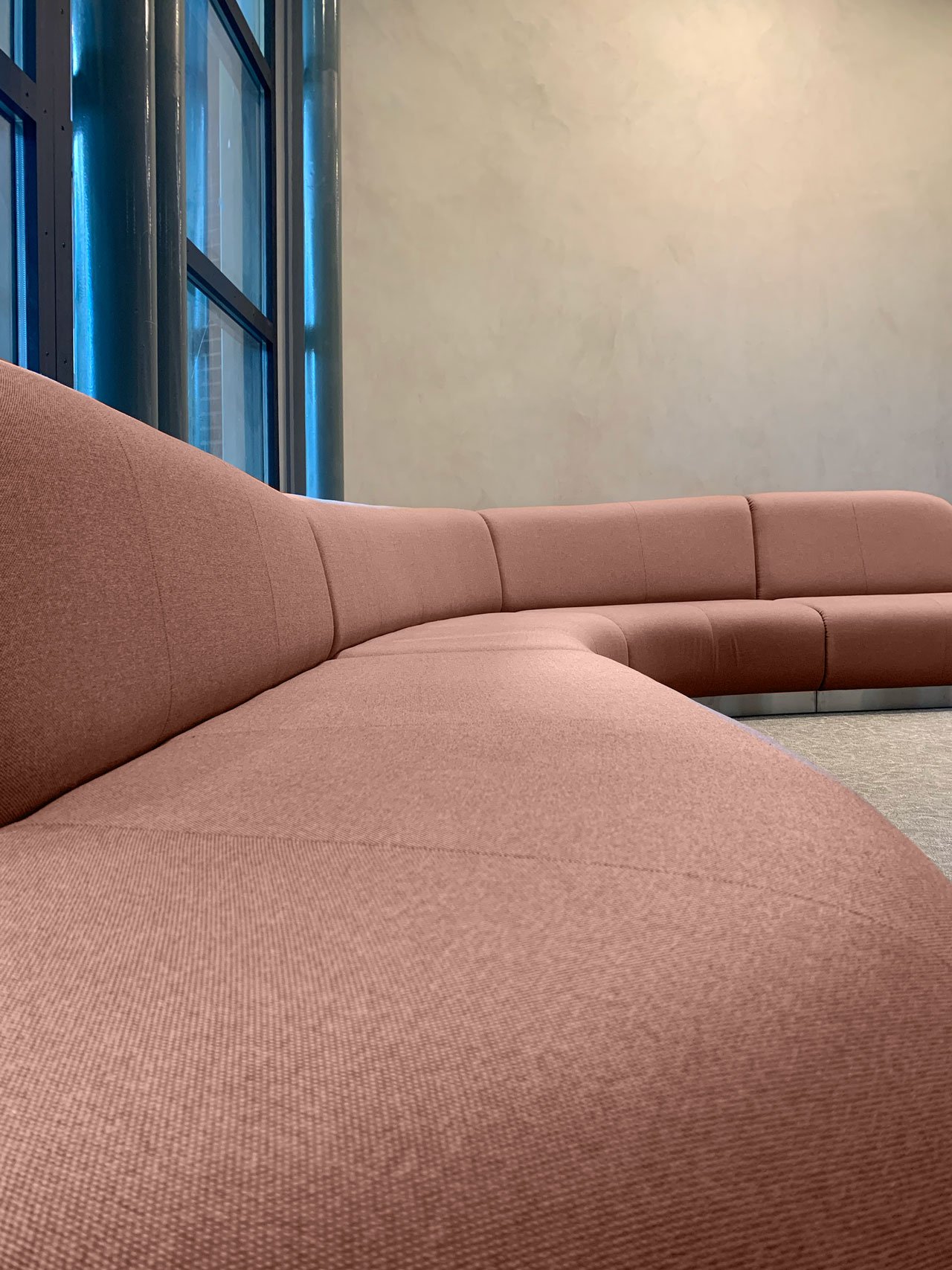


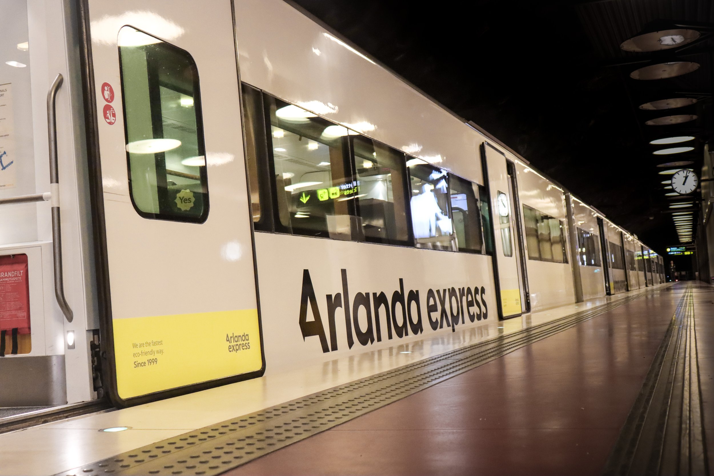


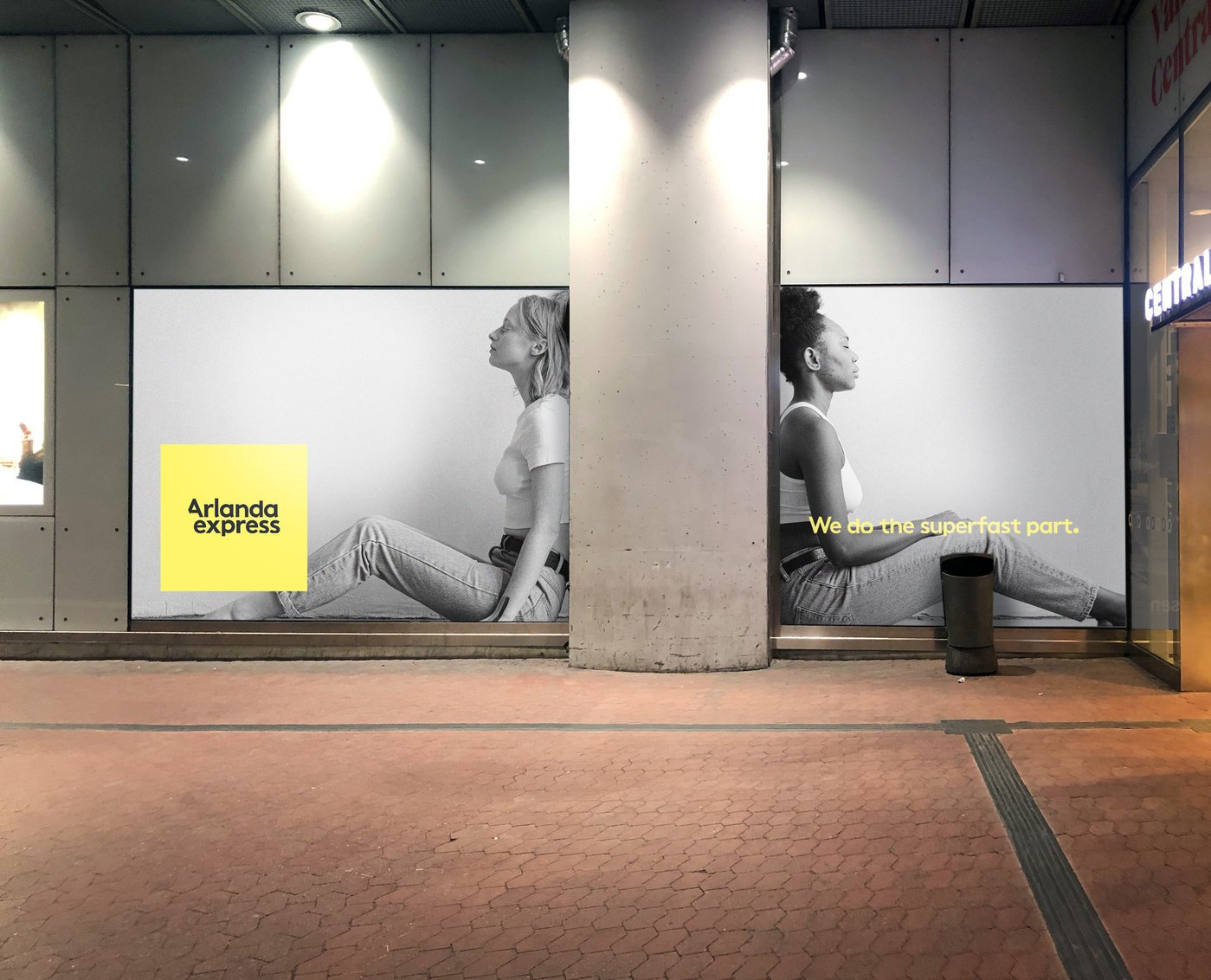

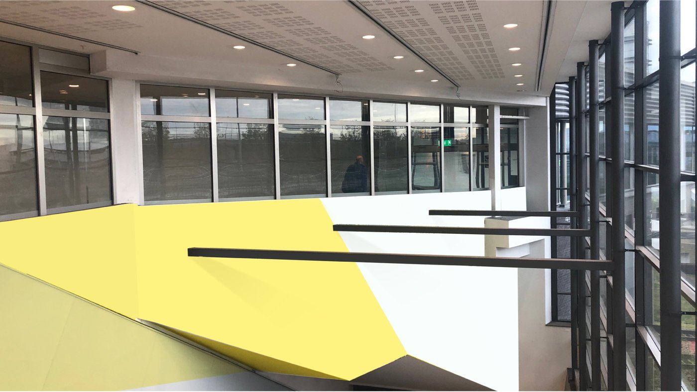

This is what we did for Arlanda express.
Red Dot Awarded Visual Identity & Strategic Brand experience Development
Ex. Visual Identity and implementation, Brand experience, Strategy, Visions, Signage and Train Livery Design to name a few.
As Arlanda express trusted brand experience partner - TBD To Be Designed created a cohesive graphic profile, signage systems, strategic brand visions, and continuous brand & business development for Arlanda express/A-Train. From logos and color palettes to POS and train communication, we ensure the brand delivers consistent impact across all channels. See what we’ve been doing since the start..
-
TBD To Be Designed served as a strategic partner, transforming Arlanda express from a pure transit service into a Brand Experience. Our primary role was to develop a new Visual Identity, Experience Vision and Design Strategy focused on helping travelers find peace of mind and recharge. This work also included strategic support for the procurement of future trains.
-
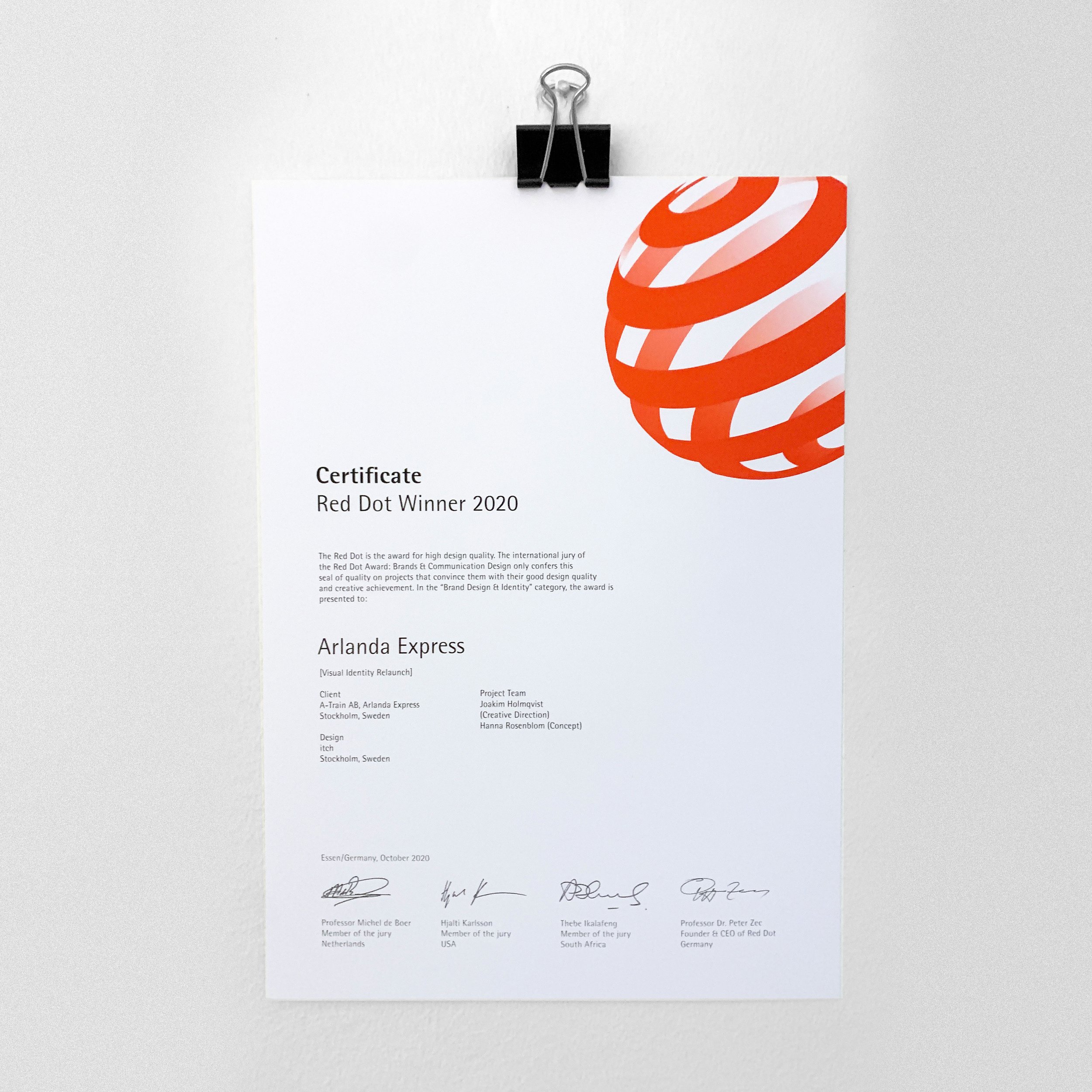
TBD To Be Designed founders developed an entirely new visual identity for both the parent brand (A to X) and the product brand (Arlanda express). This includes the striking yellow, logotypes, Train Livery and a custom commercial typeface, Transfer Sans Font. The new visual identity were honored with the Red Dot Award 2020, by the founders Joakim and Hanna back at itch. And the work continues since then to live and evolve.
-
The biggest outcome for TBD To Be Designed was the ability to scale the brand and services across all touchpoints—from digital channels (app, web, ticket machines) to physical spaces (wayfinding, signage, current and the future train fleet). This ensures a consistent and calming Customer Experience (CX/BX) throughout the entire ecosystem.
-
Yes. TBD To Be Designed supported Arlanda express with Change Design and Service Design strategies and actions during challenging periods such as the COVID pandemic, temporary track moves, safety campaigns, escalator and roof renovations. This involved ongoing agile design and journey mapping to ensure the customer experience remained seamless and premium despite external changes.
FAQ 2020 to now
Detailed
-
In order to plan the steps ahead for we identified and painted tangible versions of the future state for the business, the rooms, moveable and physical spaces we own as well as the digital spaces we need to activate the future.
-
Turning insights and customer journey mappings into tangible strategies for innovation, business and brand. To scale from Ticket Machines to app to web and beyond takes a systematic thinking. We got that snowball rolling by creating the end state.
-
Team behind TBD To Be Designed made the Red Dot-awarded visual identity back in 2020 - and have continued to develop and implement since then.
In order to plan the steps ahead for this brand we identified and painted tangible versions of the future state for the business, the rooms and physical spaces we own as well as the digital spaces that enable so much for us.
Knowing that we had big plans for the future we needed to give the brand room to grow. This meant building out a new visual identity for the parent brand, A to X. In addition, the identity for the product brand, Arlanda express, needed a revival to carry the attention and new values.
Since 2020 it’s sporting a clean bright yellow and so much more. These two identities have since been brought to the world through an endless array of touchpoints all over the eco system.
Simply put it’s Brand Experience in practice. -
A Custom commercial track mark font was designed to be used throughout all brand assets. It’s quirky, and the faults is made to be subliminally read over and over again. Made to stick. The quirks and cuts borrows small fragments from travelling. Views from a plane window, that painted numbers painted on the runway or platforms. Fragments of life lived embedded into one simple font to be sent through all our messaging.
Refined into todays digital Express Sans. -
Airports and train stations are very busy places. A very important aspect of our brand is to be able to help guide and lead our customers (and others) right. We have created a scalable wayfinding system complete with icons, colors, shapes and words to make sure our customers are always finding their way.
-
We designed and won a Red Dot for the new train livery brand adaptions to the fleet of trains. With a distinctive colour scheme and branding, serving to identify and make the operator stand out.
New designs coming up.
-
We did a lot of research in the start up phase of this project through both interviews, service safaris, observation and journey mapping to be able to control all important areas for wayfinding, transit or to simply relax by smart services.
-
How to design and communicate whats wrong, and how to prevent by communicating the right way not when it’s to late.
-
During challenging times. Covid, the Temporary track move summer 2023 and the roof renovation summer 2024 we supported the fine team with journey mapping, strategies and agile design plus the execution on hands on wayfinding and experience design.
Our next case
A brand designed to take on center stage.

